


The fear of the blank page also exists for a project manager in charge of creating a new website. To develop ideas, present them to management, to clients, and communicate with the various stakeholders (copywriter, graphic designer, programmer, marketing manager, etc.), a diagram is often more effective than a long speech.
Paper offers total freedom: no technical constraints, no visual distractions, no limits imposed by a theme or a builder. It allows you to design a project thoughtfully and avoid costly structural mistakes. The following examples will help you present it professionally. You are free to use vector drawing software or, at least at first, simply a sheet of paper so you don’t restrict your creativity.
Objectives and visitor profiles
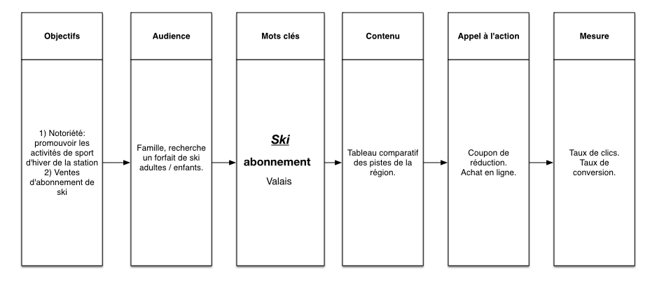
The first task is to identify two or three types of visitors who are expected to interact with the website and define their profile.
Let’s take the example of a small mountain resort. A first profile can be outlined as follows:
- A primary objective for the site would be to promote the resort’s winter sports activities, and a secondary objective to sell ski passes online.
- It is possible to define a family audience — a couple with children — looking for an affordable offer for a weekend in the region. For more realism, you can refine the personas by creating very detailed profiles to better understand the visitors.
- We already have the main keyword ski, and we can add secondary keywords such as price, pass, package, and the geographic location Valais. These keywords will serve as a basis for SEO and advertising with Google Ads. They can be developed in what is called a keyword map.
- The content envisioned to interest this audience could be a summary table of leisure activities in the region.
- A call to action could be created in the form of a badge offering a discount coupon for leisure activities and for purchasing equipment in the resort.
- Clicks on this badge/button will be measured as goal conversions by an analytics tool such as Google Analytics or Matomo.
Once you have a good idea of who your visitors are and the actions they will take on your site, you can move on to the next step: defining sections and content.
Mind map and site structure
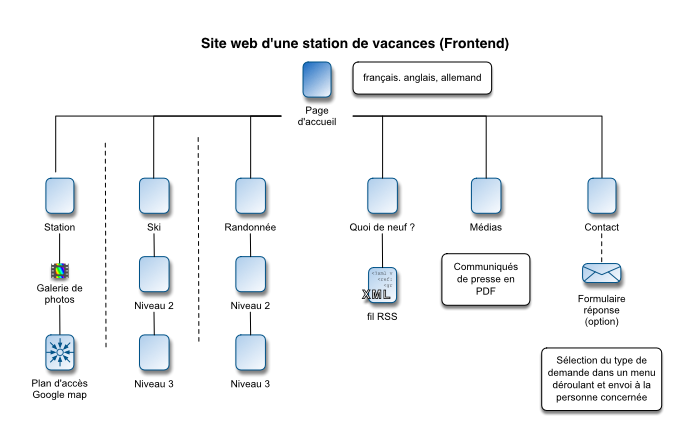
The tree structure describes the hierarchical structure of a website, which consists of a home page with links to subsections and inner pages (like the branches of a tree). It is important to define the site’s content in the different desired formats (texts, images, videos, sounds, slideshows or other features). The final tree structure plays an important role for the ergonomics of the site and the creation of URLs (page addresses) by CMS (Content Management System). It should allow different types of users to access content without unnecessary clicks and should facilitate the proper understanding of the site by search tools.
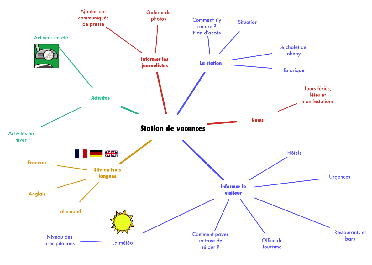
The designer can first create a mind map to jot down all kinds of content ideas in bursts, without thinking too much about feasibility or site structure. This allows for more creativity before synthesizing and finalizing the definitive tree structure. The tree structure will serve as a reference in project management not only during the site’s conception, but also for future updates. Freeplane, Inspiration or OmniGraffle are suitable tools for creating this type of diagram. Personally, I like text-based tree structures and bullet lists created with OmniOutliner, because it is easy to add a new node to describe a page.
Wireframe
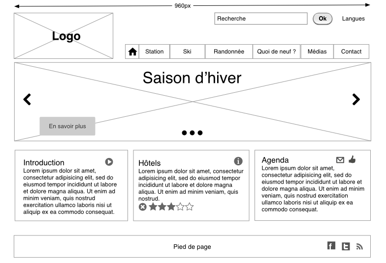
A wireframe is a simplified diagram of the layout where images are represented by rectangles with a Saint Andrew’s cross inside, so that the designer’s attention is focused on the structure of the page rather than its visual appearance. Indeed, a good wireframe must leave room for the designer. The wireframe can be created quickly with vector drawing software such as Affinity or OmniGraffle, or specialized tools like Figma, to describe any interface element. Some designers like to sketch pages and processes of their site in pencil as thumbnails before cleaning them up. Everyone has their own technique, but the goal is to plan the project’s development in advance and validate it, because its implementation can require a lot of effort if you have high standards and care about doing a good job.
A responsive web layout uses a fluid grid to adapt to different screen sizes: desktop, tablets or mobiles. Pages are divided into distinct blocks: interface elements that belong to the general canvas of the page (header, footer, navigation) and what corresponds to the editable area of each page. You need to establish priorities, with the most important elements at the top of the fold (the area theoretically visible on screen when the page opens). The hierarchy established in the wireframe will be reflected in the graphic design:
- titles,
- subtitles,
- body text,
- calls to action.
Different sizes or fonts will be used for the texts, but alignment and spacing also play a role. The mobile layout must reflect the smallest screen size:
- stacking of elements,
- centered text and calls to action,
- reduced image sizes,
- hamburger menus.
It will also reflect the semantics of HTML5 tags, which is important for proper page understanding by search engines, AIs, or screen‑reader programs that improve accessibility for people with limited vision (tags such as h1, h2, navigation, main, section, aside, footer, etc.).
Design patterns
An ergonomic site will use conventions to help the user navigate the page intuitively. Design patterns are best practices to follow for common interface elements such as:
- a dropdown menu,
- a hamburger menu,
- a footer with secondary links,
- a hero image,
- content blocks,
- breadcrumb navigation,
- pagination, etc.
The photo slideshow is a design pattern that everyone has encountered at least once while browsing the web. It has arrow buttons to move forward and backward and allows you to choose a photo further in the list by clicking on dots. Reusing this pattern on your site will make it easier to understand. To easily include design patterns in your diagram, you can download a wireframe kit compatible with your drawing software. It is a canvas containing predefined interface elements. You can also draw inspiration from this list of design patterns.
Designing a website on paper is a simple, fast and extremely effective method. It helps clarify ideas, avoid costly mistakes, and lay solid foundations before development. You are now ready to make a good impression as a web project manager.
Sources:
Marketing in the Age of Google – Wiley
The Web Designer's Roadmap – SitePoint